

GRAYL “Fill. Press. Drink”
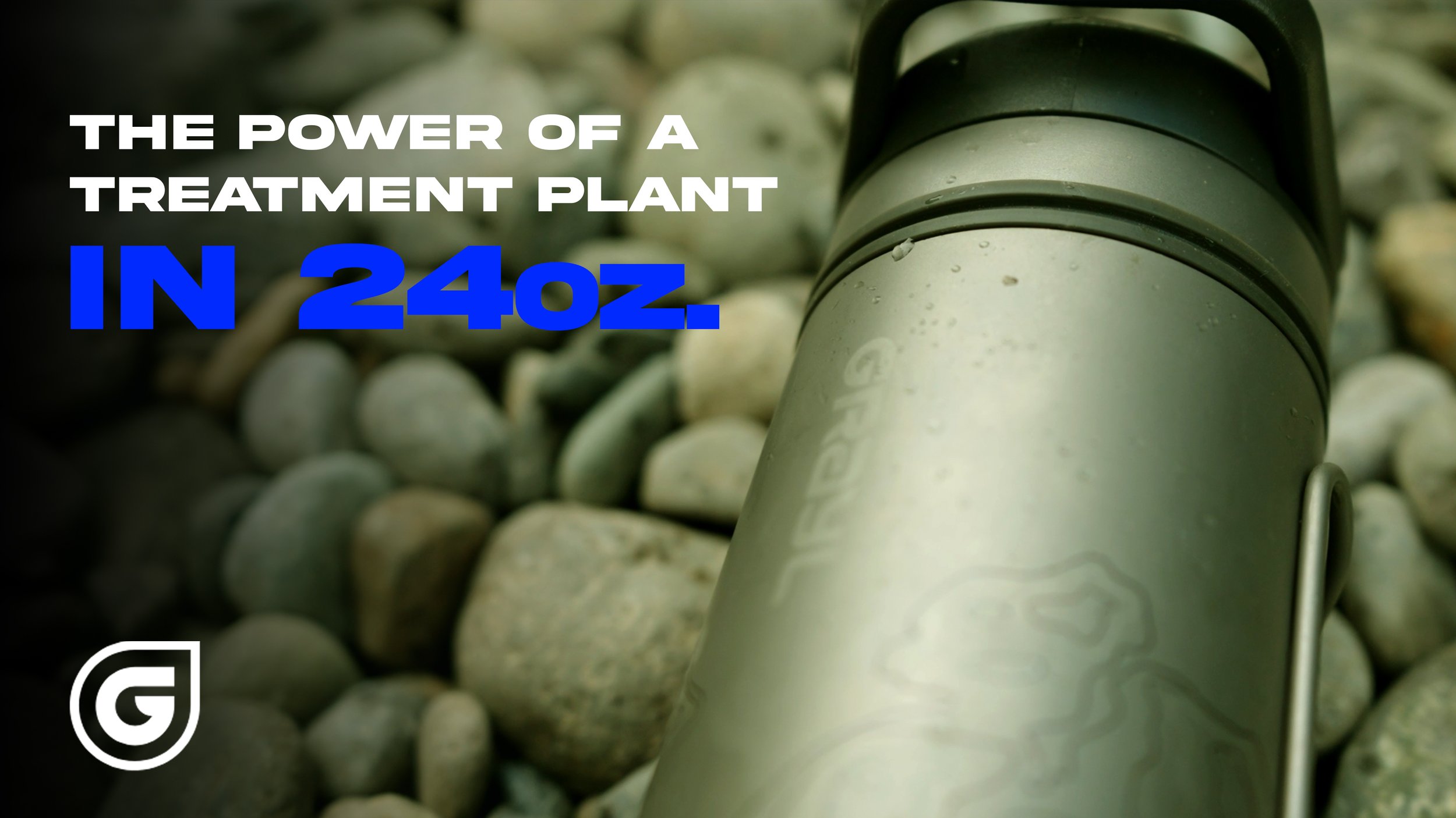
The outdoor water filtration market is crowded with plastic bottles that look like toys. The challenge for the GRAYL GeoPress Ti was to communicate its premium titanium build and professional-grade utility. It needed to look less like a "water bottle" and more like a "survival tool."
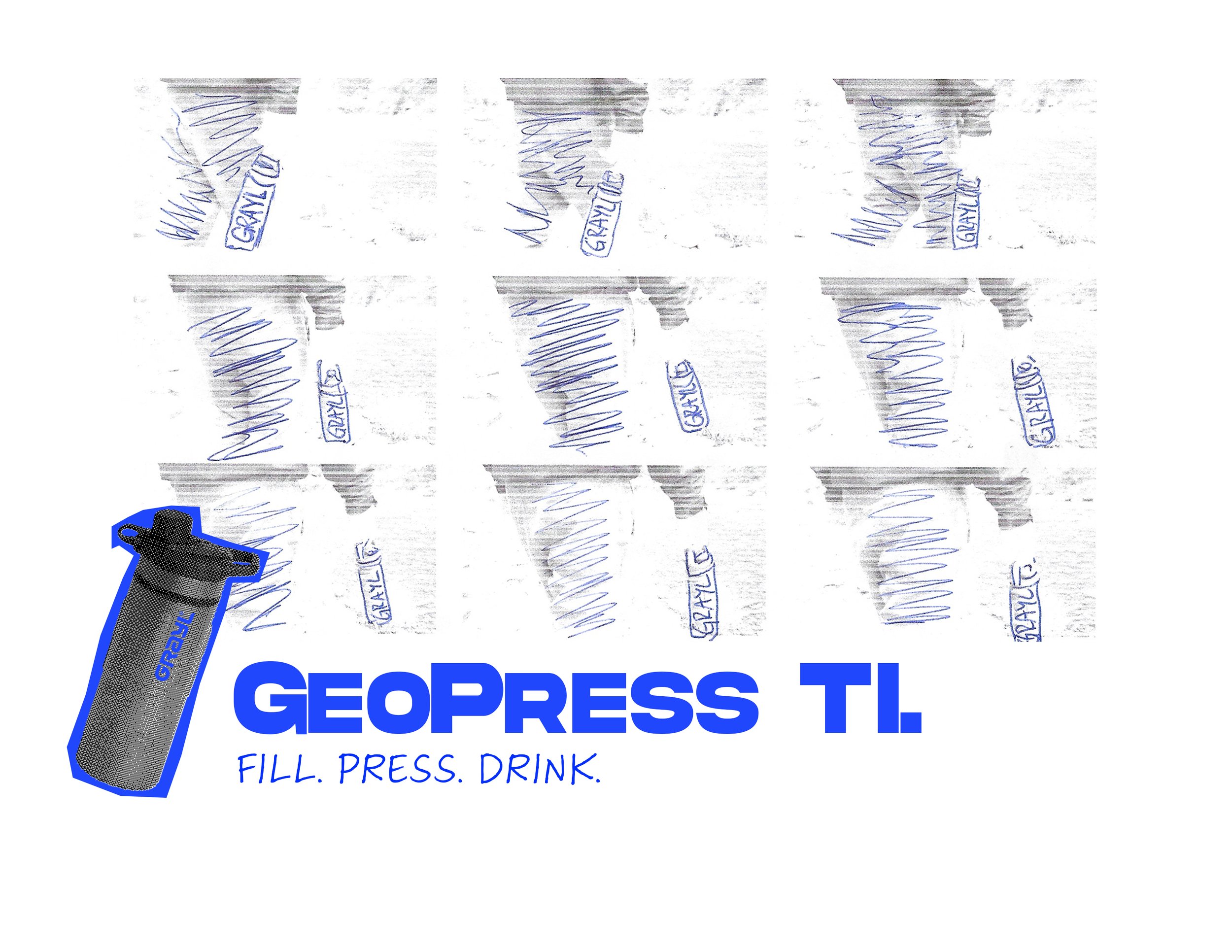
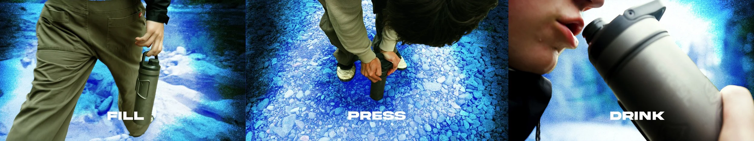
In the backcountry, simplicity is a luxury. The focus was the three-step ritual, “Fill. Press. Drink.” By stripping the messaging down to these three verbs, complexities are removed.
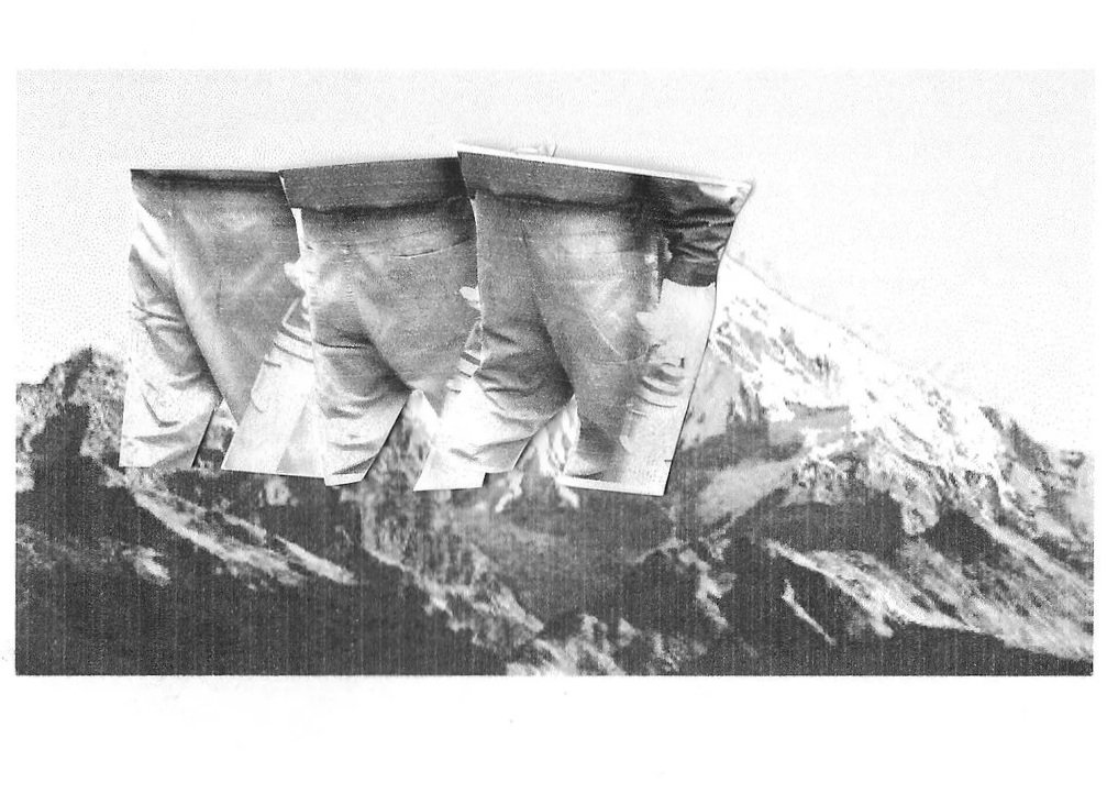
Tonally a high-contrast, blueprint-inspired aesthetic was used. "X-ray" style halftone graphics and blueprint blue accents were used to signify GRAYL’s commitment to engineering a high-tech water filtration system. Blue also happens to be affiliated with clarity and… water. The photography remains grounded in the environment—rocks, rivers, and grit—while the graphic overlays convey the advanced technology working inside the bottle.
Creative Direction: Ollie Yue
AD/Design/Production: Ollie Yue